Early iPhone 18 Dark Cherry Design Ideas: A Comprehensive Guide
Rumors around future iPhones often begin with color and silhouette, because those cues shape excitement long before a technical sheet surfaces. A possible Dark Cherry direction for early iPhone 18 concepts feels especially relevant as buyers keep leaning toward richer, more expressive finishes that still look refined at work and at home. Once material choices and display ambitions enter the picture, the conversation stops being simple fan art and becomes a useful way to read where premium phone design may be heading.
This article follows a practical outline. It starts with why the Dark Cherry idea feels believable in the current design climate, then moves through broader color trends, likely material choices, and display expectations. It closes with a consumer interest overview focused on who would care most, who might hesitate, and why a color concept can matter almost as much as a processor leak.
Why the Dark Cherry Idea Has Real Design Logic
Early iPhone concepts are often dismissed as wishful sketches, yet color ideas deserve more attention than they usually get. In premium smartphones, finish is not a tiny cosmetic detail tacked on at the end of development. It is part of the product story. A new color can signal a change in identity, mark a generation as more playful or more mature, and even help distinguish one cycle from another in a market where front-facing design differences are getting harder to spot at a glance.
That is why a Dark Cherry iPhone 18 concept feels more grounded than it may first appear. Apple has a long history of using color strategically. Some years lean into restrained metallics, while others introduce a headline shade that gives reviewers, retailers, and casual shoppers something visual to remember. Bright colors can work, but deep tones often age better in the premium segment because they look elegant under different lighting conditions and pair more easily with cases, straps, and accessories. Dark Cherry sits in that sweet spot between expressive and reserved. It carries some of the warmth of red, some of the luxury associated with burgundy, and some of the mystery usually reserved for black or deep purple devices.
It also makes sense in contrast to previous Apple-adjacent color directions seen across flagship devices. Blue has often been used to suggest calm confidence. Purple tends to feel slightly futuristic. Natural metallic finishes signal engineering honesty. Dark Cherry would tell a different story. It would feel richer, more tactile, and a little more dramatic without becoming flashy. In some lighting it could read almost black; in direct sunlight it could bloom into wine, garnet, or plum-red. That kind of shift is gold for marketing photography because it makes the device feel alive rather than flat.
There is another reason the idea resonates: smartphone buyers increasingly keep their devices for longer periods. When a phone is likely to stay in someone’s pocket for two or three years, color becomes more important. People want a finish that remains interesting after the launch-week novelty fades. A well-executed Dark Cherry tone could do exactly that.
Put simply, the concept works because it matches current design logic:
• it feels premium without being sterile
• it stands out without shouting
• it allows visual depth in photos and in hand
• it offers a fresh identity without abandoning Apple’s usual restraint
None of this confirms anything official about an iPhone 18. It only shows that Dark Cherry is not a random fantasy. It is the kind of idea that fits the way flagship design conversations already move.
Color Trends That Make Dark Cherry Feel Timely
To understand why Dark Cherry keeps showing up in speculative renders, it helps to step back from phones and look at broader design trends. Across consumer electronics, fashion, interiors, and even automotive finishes, the center of gravity has shifted away from loud, flat colors and toward tones with depth. People still enjoy individuality, but many now prefer expression that feels curated rather than cartoonish. That is where a color like Dark Cherry becomes especially relevant. It behaves almost like a neutral from a distance, yet reveals personality up close.
In the premium phone market, this matters because the hardware itself has become more mature. Early smartphones often used color to look futuristic or youthful. Today, the audience is wider and more layered. A flagship phone must appeal to professionals, creators, enthusiasts, and ordinary upgraders at the same time. Dark Cherry bridges those groups better than a vivid primary red would. It can feel stylish on a desk in a boardroom, but it can also feel fashionable in a mirror photo, a social media clip, or a café tabletop shot. That balance is one reason darker jewel tones have gained momentum in many product categories.
The trend is also shaped by how people now experience devices online. A color that changes character under different lighting conditions performs better in videos, reels, and product photography. Matte black is classic, but it is visually predictable. Silver looks clean, but often appears familiar to the point of invisibility. Dark Cherry gives designers more room to create drama. It can catch warm indoor light, cooler outdoor tones, and the subtle reflections of polished metal edges. In creative terms, it gives a phone a pulse.
Several forces support this type of finish:
• consumers want differentiation without losing professionalism
• darker colors tend to hide fingerprints and small visual distractions better than glossy bright tones
• premium buyers often respond well to limited-feeling shades that appear thoughtful rather than trendy
• accessory brands can build attractive combinations around deep red, charcoal, cream, and black
There are still risks. A cherry-inspired finish can easily drift too far toward brown, making it look muddy, or too far toward purple, making it feel like a repeat of earlier color families. The exact balance would be critical. Apple, when it refines a color, usually aims for shades that look distinct in person, not only in studio renders. That is why pigment tuning, reflectivity, and surface texture matter as much as the basic hue.
If the goal is a color that feels contemporary in 2026-style flagship language, Dark Cherry fits the moment. It reflects a wider move toward richer, moodier, more dimensional finishes that make technology feel less clinical and more personal.
Materials, Finishes, and the Challenge of Making Dark Cherry Look Premium
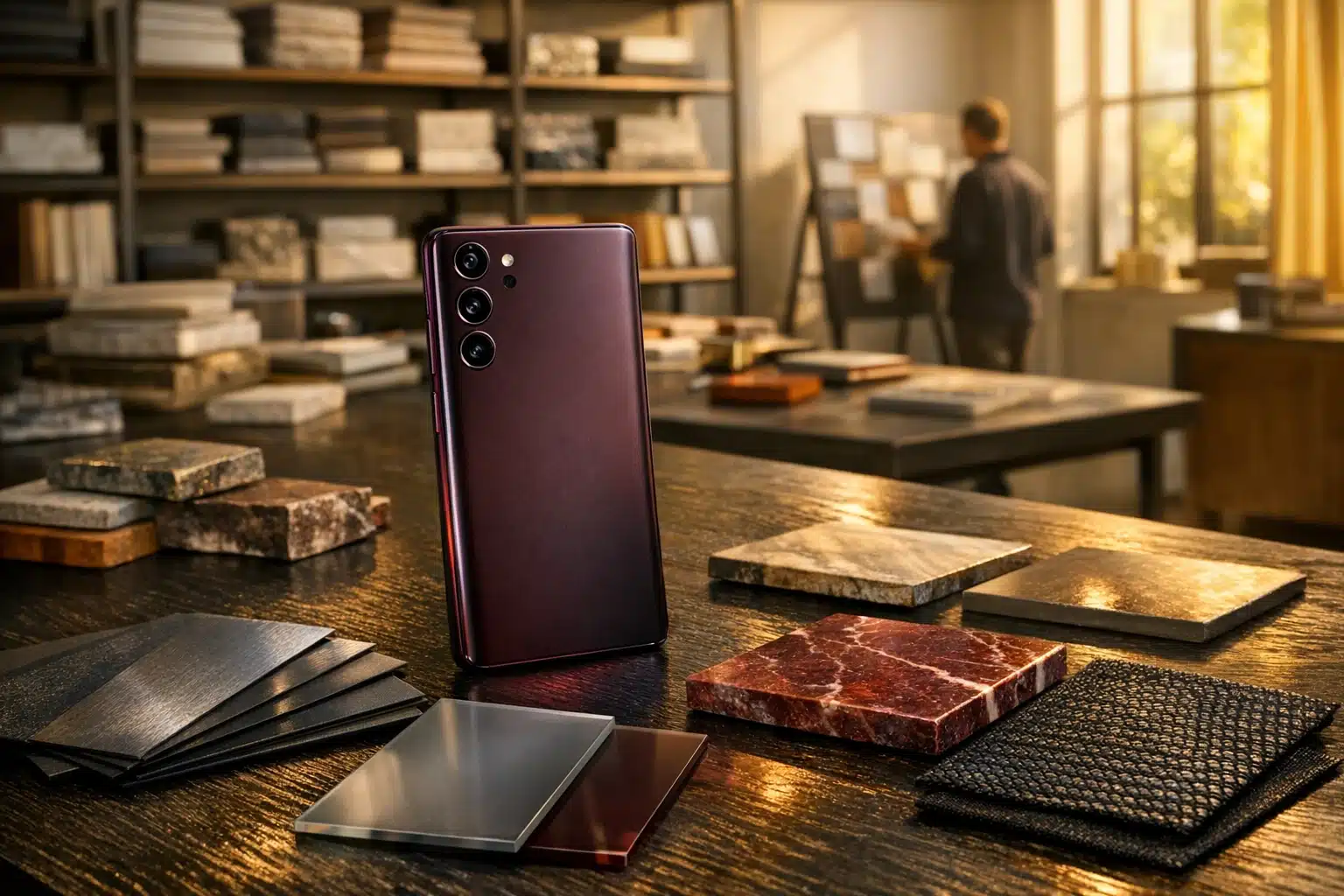
A convincing Dark Cherry iPhone would depend less on the name of the color and more on the materials used to carry it. On modern flagship phones, color is never just paint. It is the result of layered decisions involving metal treatment, glass chemistry, surface texture, coating durability, and how light interacts with the device from every angle. A deep red tone can look luxurious on one material and flat on another, so any believable iPhone 18 concept has to think beyond the back panel alone.
The frame is the first big question. If Apple continues using premium metallic construction, the company would likely have to choose between maintaining a metal that emphasizes strength and lightness or shifting to a finish that better supports color richness. Dark red tones tend to look especially dramatic when paired with satin or brushed metal rather than mirror-polished edges. A highly reflective frame can make the phone look jewelry-like, but it can also push a deep shade into a more flamboyant direction. A softer metallic sheen would probably suit the “Dark Cherry” idea better, giving it elegance instead of excess.
The rear panel matters just as much. Matte textured glass has become popular because it feels smoother, reduces visible smudges, and photographs well. On a Dark Cherry model, a matte back could create an effect similar to polished stone or deep lacquer, depending on the underlayer used. If the tone were placed beneath slightly frosted glass, it could appear calm and velvety. If it were paired with a subtle gloss beneath the surface, it could take on more visual movement without becoming slippery or flashy. This is where concept artists often simplify reality. Real manufacturing has to account for scratch visibility, consistency across units, and how the finish looks in daylight, office light, and low-light environments.
Several material strategies could work:
• a dark red matte glass back with a charcoal or graphite-toned frame
• a cherry-tinted metallic frame with a more subdued rear panel
• camera rings in a deeper metallic shade to create contrast and hierarchy
• a nearly black front that lets the color story live mostly on the rear and side profile
The camera area presents another design opportunity. Because lenses and rings already break up the surface visually, they can either elevate the finish or spoil it. A good Dark Cherry device would likely avoid bright silver accents and instead lean into darker metallic surrounds, which would make the whole object feel more cohesive. Even the buttons matter. Slightly darker power and volume keys could add depth without calling attention to themselves.
In short, Dark Cherry is not just a color choice. It is a materials problem, a coating problem, and a lighting problem. If those pieces align, the result could look genuinely premium rather than simply unusual.
Display Expectations: What the Front of an iPhone 18 Would Need to Match the Back
A striking rear finish can attract attention, but a flagship phone is judged every day by its display. That is where users spend their time, and by the time an iPhone 18 arrives, expectations for the front of the device will be even higher than they are now. A Dark Cherry concept only feels complete if the display side keeps pace with the elegance suggested by the color. Otherwise the design becomes unbalanced: beautiful from the back, familiar from the front.
The first expectation is obvious but important: thinner, more uniform bezels. Premium smartphone buyers increasingly notice symmetry, even if they cannot always describe it in technical terms. A display that stretches closer to the frame makes the hardware feel more modern without forcing a larger body. If Apple can reduce bezel thickness while preserving durability and touch reliability, that alone would make a Dark Cherry iPhone feel more jewel-like in the hand. The device would read as a single refined object rather than a screen placed inside a colored shell.
Brightness and efficiency would matter too. The best displays today are not only vivid; they stay legible outdoors, adapt intelligently, and waste less power while doing it. By the time an iPhone 18 generation is being discussed seriously, buyers will reasonably expect continued gains in outdoor visibility, smoother adaptive refresh behavior, and lower reflectivity. Anti-reflective improvements may sound less glamorous than camera rumors, but they profoundly shape perceived quality. A darker phone finish paired with a cleaner, less reflective display would feel especially sophisticated.
There is also the question of front-facing components. The industry has spent years trying to hide sensors more effectively. A fully invisible camera system remains technically difficult because light transmission and image quality still fight each other, but reduced cutouts or more discreet sensor packaging are realistic expectations. Even partial progress would matter. When the front of the phone looks calmer, the back color becomes more meaningful because the whole device feels intentional.
A sensible display wish list would include:
• slimmer and more consistent bezels
• strong peak brightness and reliable outdoor readability
• excellent color accuracy rather than oversaturated tuning
• refined adaptive refresh for smooth scrolling and efficient battery use
• lower reflectivity and a cleaner integration of front sensors
There is a subtle emotional layer here as well. Dark Cherry is a warm, character-rich idea. A nearly borderless black front would complement it perfectly, like a tailored coat with a hidden lining that only reveals itself when you turn it in the light. For many buyers, that balance between visible personality and everyday usability is what defines a premium phone. So while the color concept draws attention, the display is what would validate it.
Consumer Interest Overview and Final Take for Apple Watchers and Buyers
Consumer interest in a Dark Cherry iPhone 18 concept is not difficult to understand. Smartphone upgrades have become more deliberate, more expensive, and more emotional. When major performance gains are harder for everyday users to notice, design becomes a larger part of the decision. People still care about cameras, battery life, and long-term software support, but they also want a device that feels good to own. Color enters that equation in a surprisingly powerful way because it shapes the first impression, the daily tactile experience, and even how a phone looks in photos shared online.
Dark Cherry would likely attract several kinds of buyers. The first group is design-conscious upgraders who are tired of endless gray, silver, and black. The second is Apple enthusiasts who enjoy owning a model that feels distinct without being gimmicky. The third is casual shoppers who may not track rumors every week but immediately respond to a finish that looks richer and more premium than standard options on a store shelf. For these people, a color like Dark Cherry can be the difference between “nice phone” and “this is the one I want.”
There are also reasons some consumers might hesitate. Conservative buyers often choose neutral finishes for better resale flexibility or broader workplace appeal. Many people use thick cases that hide most of the hardware anyway, reducing the value of a special color. Others may prefer lighter metallic tones because they feel cleaner or more timeless. That does not weaken the Dark Cherry idea; it simply means the finish would work best as part of a balanced lineup rather than as the dominant identity of the whole range.
The strongest signs of interest would likely come from:
• concept render engagement on social platforms
• accessory makers quickly imagining matching or contrasting case colors
• reviewers discussing the finish as a major differentiator
• buyers who want a premium device that feels less predictable than black or titanium gray
For the target audience of this topic, the takeaway is practical. If you follow future iPhone design, Dark Cherry is worth watching because it aligns with real shifts in taste toward deeper, more dimensional finishes. If you are a potential buyer, the color would matter most when paired with strong materials and a cleaner display design; without those, it would remain just a clever paint idea. If you are interested in product design more broadly, this concept shows how color, texture, and screen architecture now work together to define the next generation of premium phones.
In the end, Dark Cherry is compelling not because it guarantees anything about the iPhone 18, but because it captures where consumer desire seems to be moving: toward technology that feels polished, personal, and visually memorable without losing everyday sophistication.